


The Surefire Ratio: My Custom Risk Ratio that Supercharged My Investing
When you need something even a little bit sharper...


We’ve all used it. It’s seen as the ‘gold standard’ of investment metrics. But the Sharpe ratio is a dated formula that takes a naive assumption on the market and runs us into walls. It has no concept of prolonged drawdowns or causality, and those that continue to use it as the gospel are quantitative luddites handicapping their own success.
But get this:
With a simple financial ratio, we can describe what makes a strategy great and incorporates all the blindsides that the Sharpe ratio misses.
The Dull State of the Sharpe Ratio
All, and I mean all investment managers and hedge funds use the Sharpe ratio as a way to advertise performance. But the Sharpe ratio only looks at the mean returns versus the volatility of those returns. It has no concept of losing streaks, time underwater, and it penalizes upside volatility the same as downside volatility.
Even more “sophisticated” metrics like the Sortino and Calmar ratio, which consider things like downside volatility and maximum drawdown, do so in a way that treats returns as independent and identically distributed which is simply not true.
Equal Sharpes, Contrasting Curves
Consider the following two equity curves. They have the same Sharpe ratio. They end up on the same exact equity. They should be equal, right?
But which one would you rather invest in? It’s clear that the Baseline is better than the AR(1) Clustered strategy from a visual perspective. But our financial ratio is telling us that they should be the same.

The reason is because a Sharpe ratio treats every return as completely independent. It does not consider sequence, prior returns, etc. as at all important. When we look at the drawdown of both strategies, we see the clear issue.
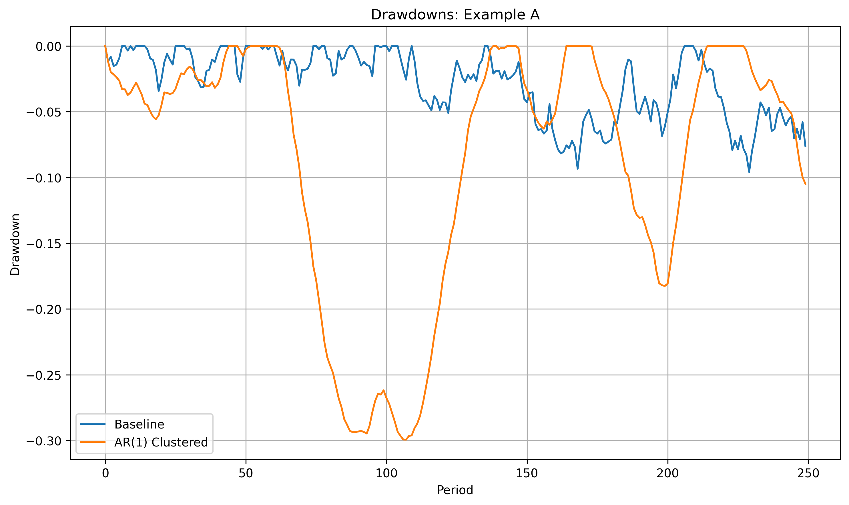
While although both of them after 250 days end up on the same amount of equity, how they get there is extremely different.
No investor want to be in prolonged drawdown, even if that means lower returns. In this case, the Baseline strategy is not showing as much momentum. But, it’s, for the most of its run, outperforming the AR(1) Clustered strategy.
What is needed is a metric that considers this.
Step One: The Integrated Drawdown
Rather than just looking at the mean returns and their volatility, like the Sharpe ratio does, we need to look at the way that a strategy has actually played out over time.
This rejects the idea that returns are completely independent and identically distributed (idd). And, this makes sense. If you have a system that performs well in high momentum periods of the market, it’s going to win consistently and repeatedly during those periods.

Likewise, if the market is choppy, it’s going to struggle. These periods generally last for some time. It is not just that one day it exists, and one day it doesn’t. Otherwise, it would not be considered momentum.
And so, let’s instead take a strategy and add up all the area underneath the drawdown curve. This will be called the Integrated Drawdown. It tells us not only how much we’ve drawn down, like a maximum drawdown metric, but also for how long.
Strategies that drastically drip really quickly, but recover, are generally better to investors than strategies that moderately dip, but remain underwater for months or years.
Thus, we can define the Integrated Drawdown as:

Which for regular people, simply means, add up the area under the drawdown curve. Now, our plot looks a lot better:
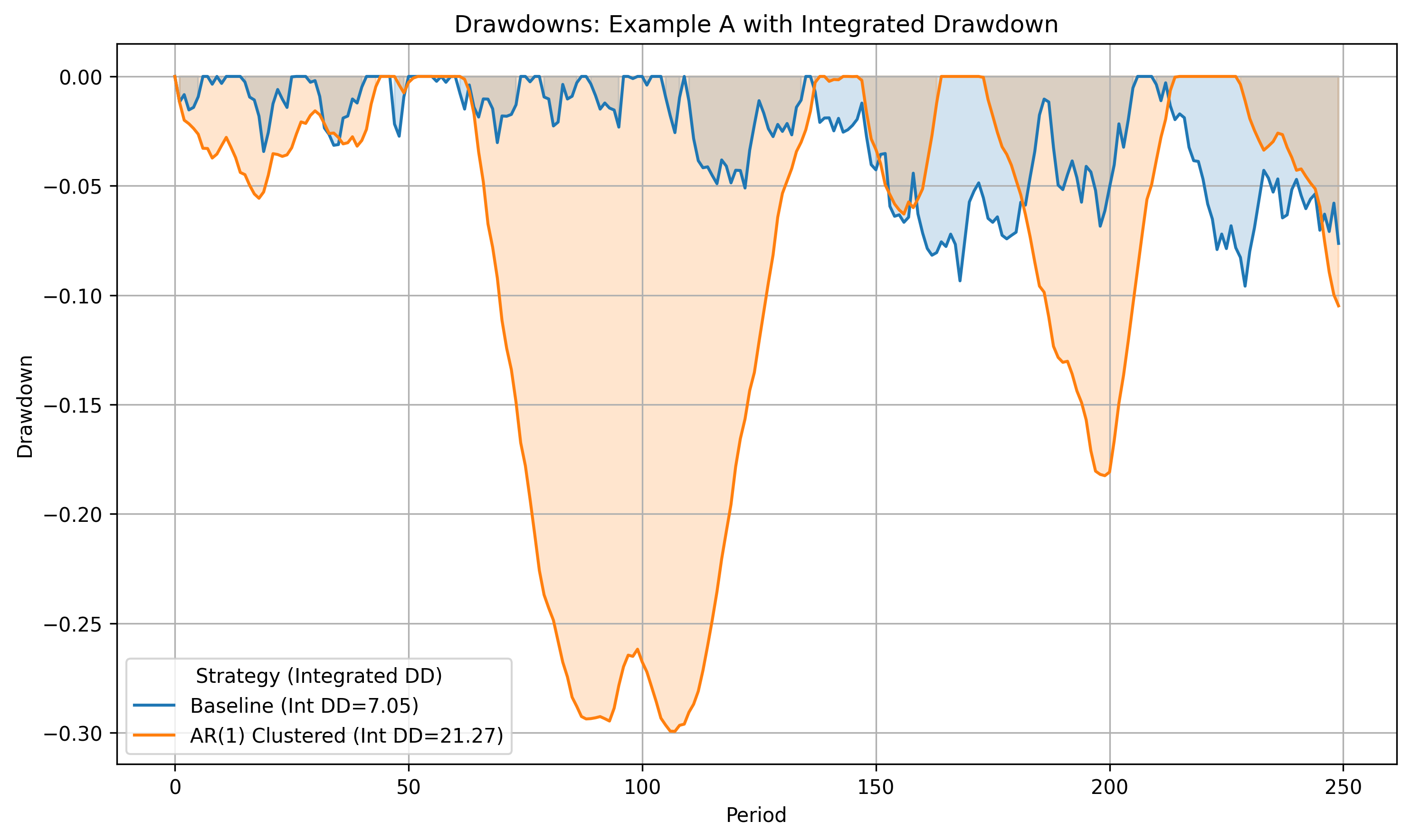
The baseline strategy has an Integrated Drawdown of 7.05 and the AR(1) Clustered has an Integrated Drawdown of 21.27. Higher scores are worse. A ‘perfect strategy’ (which is not possible unless it’s 100% risk free) has a score of 0.
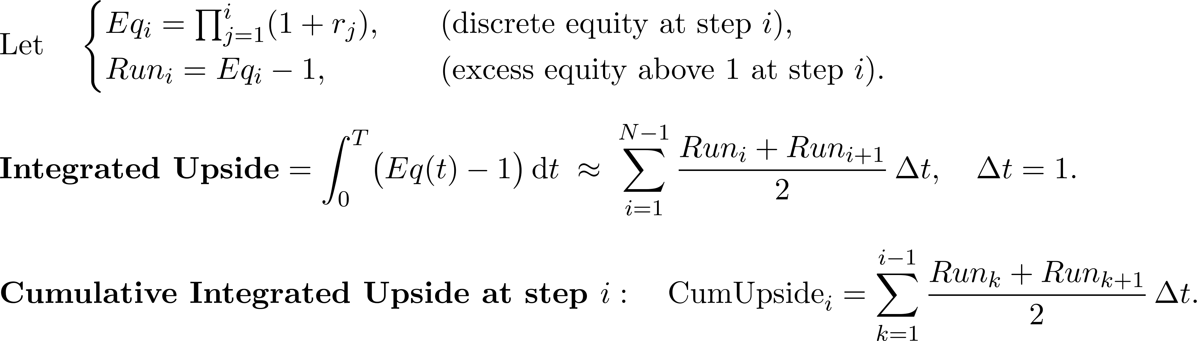
Step Two: The Integrated Upside
And so, on the flip side, we can also look at the Integrated Upside which I define as all of the area above the initial equity value of 0 for a given time frame. This, especially in comparative analysis, is helpful in showing which strategies are performing the best over time. Strategies that maintain their edge will be rewarded greatly with a higher Integrated Upside.
I define the Integrated Upside as follows, with a definition for the Cumulative Integrated Upside at any given step in the equity curve:
Here is how the Cumulative Integrated Upside evolves over time on our two equity curves:
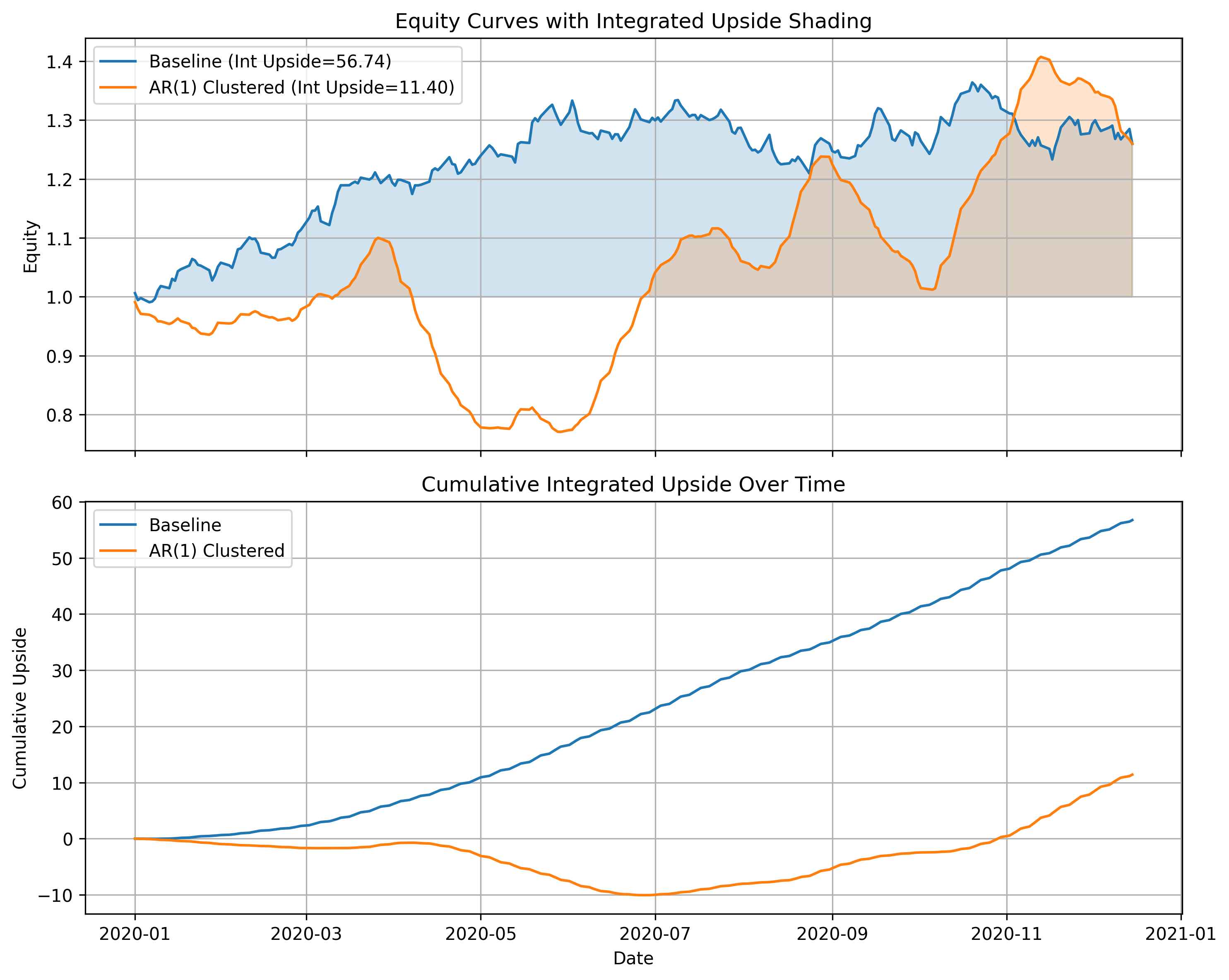
You can clearly see how the Baseline strategy is superior because it maintains its equity above 0 for the entire series. And, while the two eventually end up on the same equity curve, that is not as important as being above water for the entire duration of the timeframe we’re looking at.
And so, although the Baseline does have period of drawdown where it suffers, it’s not doing so in any catastrophic way.
Furthermore, if the AR(1) Clustered strategy catches up quickly over time while the Baseline stagnates, we will be able to see this in the increased change in the cumulative integrated upside over time.
We can also use this metric in a windowed strategy to get a better picture of which strategies are performing well in a given moment in time.
Step Three: The Integrated Upside Downside Ratio
The Integrated Upside Downside Ratio is simply dividing the Integrated Upside by the Integrated Downside.

This gives us a metric that exponentially improves as the amount of time underwater shrinks while also rewarding increasing upside.
Remember, a large Integrated Drawdown is bad, while a large Integrated Upside is good. Below is the change in the IUDR if we keep the downside fixed and change the upside (top plot), and vice versa; keep the upside fixed and change the downside (bottom plot).

The metric rewards minimizing the drawdown vastly more than increasing the upside. This is good for optimization problems where you want to avoid time underwater first, and once a system has optimized to some local minima, you want to slowly investigate how to increase the upside.
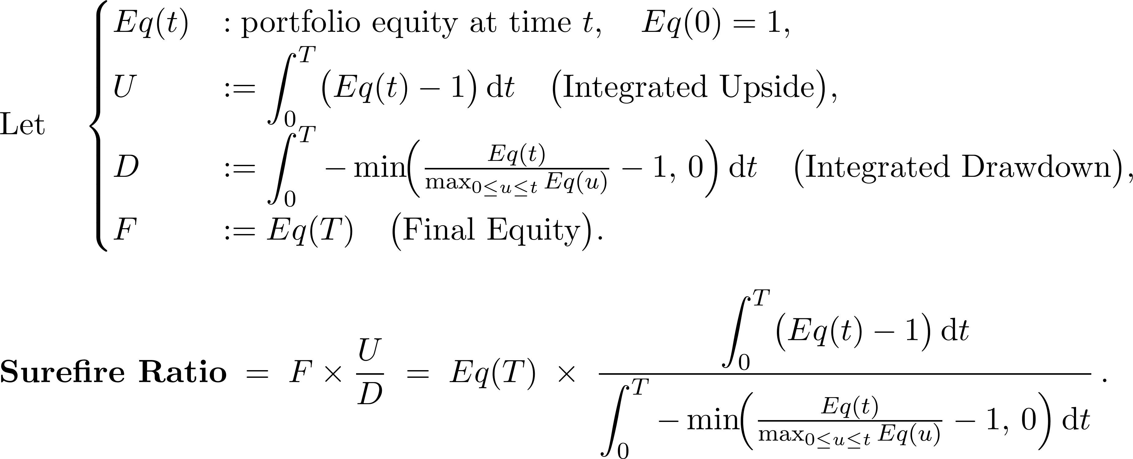
Final Step: The Surefire Ratio
The Integrated Upside Drawdown Ratio is an amazing concept, but it still has it’s flaws. I can come up with two equity curves that have the same IUDR, but vastly different equity curves.

To fix this, I introduce the Surefire Ratio, which simply multiplies the IUDR with the final equity, thus scaling that ratio by which strategy performed better. Therefore, our final equation is:
And that chart now looks like this:

With the Surefire ratio of Strategy 2 being 57% greater than Strategy 1.
Next Steps & How to Get the Code
So, ready to start using the Surefire Ratio in your code? Visit the notebook now and get the Python definitions and start plugging away!

Don’t have access? Become a paid subscriber and gain access to this notebook and all other strategies and notebooks from previous posts and future posts!
Now that you understand the weaknesses of the Sharpe ratio and the benefits of more sophisticated metrics, why would you ever turn back?
Let me know how this has helped you in your search, and like always, happy researching!